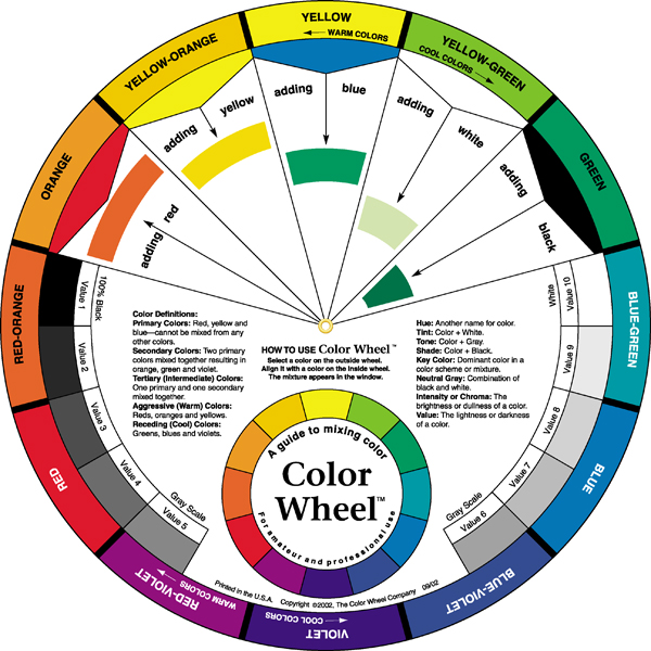
Color is one of the most powerful tools in design, art, and even woodworking finishes. Whether we’re choosing a paint, dye, or stain, understanding how colors interact helps us create harmony instead of chaos. The easiest way to see this is through the color wheel—a simple but powerful guide to how colors relate to one another. Learning to mix and combine colors such as pigments and dyes takes a lot of practice and a keen eye which enables us to make a unlimited selection of wood finish and stain colors. One of my favorite color wheels is made by the Color Wheel Company shown in the feature image.
What Is a Color Wheel?
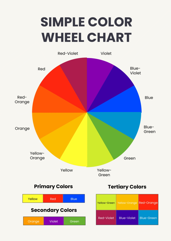
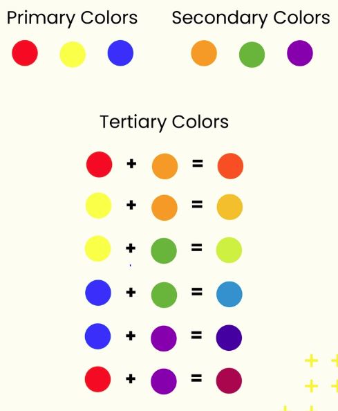
The color wheel is a circular chart that organizes colors by their visual relationship. It’s divided into primary, secondary, and tertiary colors, and it’s the foundation of color theory.
• Primary Colors: Red, Yellow, Blue – the building blocks.
• Secondary Colors: Green, Orange, Purple – made by mixing two primaries.
• Tertiary Colors: Yellow-orange, red-orange, red-purple, blue-purple, blue-green, yellow-green – combinations of primary + secondary.
Warm vs. Cool Colors
• Warm colors (reds, oranges, yellows) feel energetic, cozy, and inviting.
• Cool colors (blues, greens, purples) feel calm, refreshing, and soothing.
The Rotating Color Wheel allows a visual of what color changes are available by mixing certain colors.
Color Harmony Basics
The magic of the color wheel comes from how you combine colors in a room or painting. Here are some beginner-friendly schemes:
- Complementary Colors
o Colors directly across from each other (red + green, blue + orange).
o High contrast, bold, and eye-catching. - Analogous Colors
o Colors next to each other on the wheel (blue, blue-green, green).
o Soft, natural harmony. - Triadic Colors
o Three colors evenly spaced (red, yellow, blue).
o Balanced but lively. - Split-Complementary Colors
o One base color + two colors next to its complement.
o Vibrant without being too harsh.
How We Apply This in Practice
We take these colors and mix them in differing ratios to make unlimited color combinations. Other uses :
• Art & Design: Use complementary colors to make focal points pop.
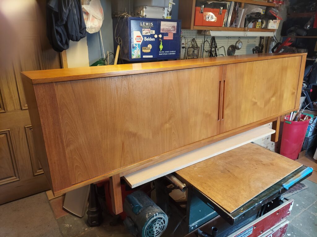
• Wood Finishing: Pick dye or stain tones that either contrast with or complement the wood’s natural hue.
• Decor & Style: Analogous palettes make rooms feel calm, while complementary palettes add drama.
Final Thoughts
The color wheel is more than just a chart, it’s a roadmap for creating universal color combinations. Understanding how colors combine and relate, allows us to perfectly match a project colors applied in a factory only last week or by a craftsman centuries ago.